Royal Botanic Gardens Kew
GEA — Seed Research Identity & Tool Design
Scientific seed research often operates across fragmented tools, formats and documentation standards. This limits interoperability, knowledge transfer and scalability. GEA required a modular identity and structural framework capable of supporting scientific workflows while communicating credibility across research communities.
Inside the project
Goal
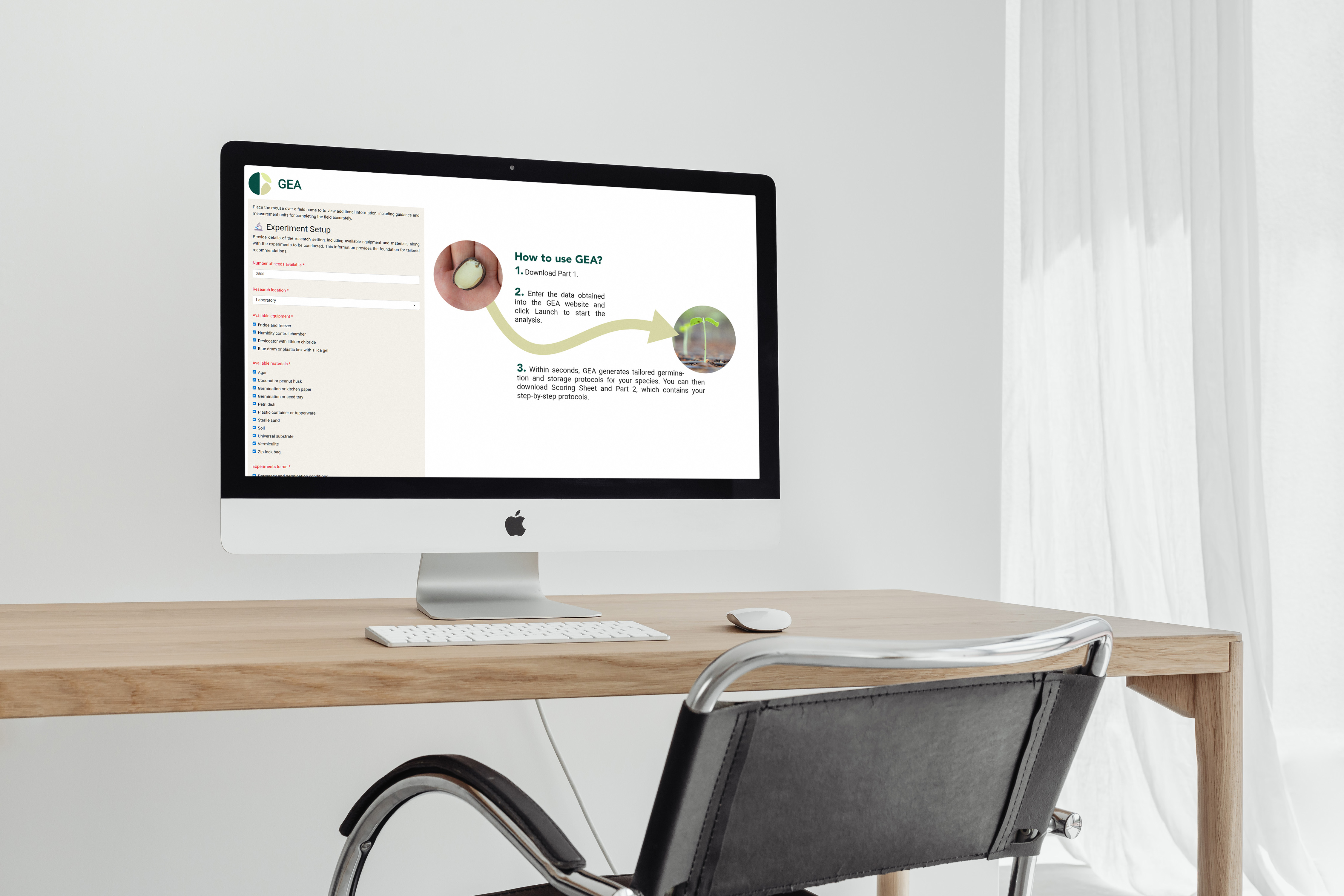
Develop a coherent structural and visual system for GEA (Germination, Dormancy and Storage Experiment Assistant) that supports modular scientific workflows and enables scalable cross-platform implementation.
Approach
System Framing
Mapped key user groups (labs, nurseries, research institutions) and defined workflow intersections across germination, dormancy and storage.
Information Architecture
Structured the tool into modular components to support flexible deployment across research environments.
Design System
Created a scalable identity and interface framework supporting digital interfaces, documentation standards and academic communication.
Impact
Established a coherent structural and visual foundation enabling scientific alignment across research segments. Created a scalable system architecture supporting future tool expansion and interdisciplinary collaboration.